Tutorial: Computations
You can work through this tutorial using R or Python code examples. Select your preferred language:
Overview
Quarto supports executable code blocks within markdown. This allows you to create fully reproducible documents and reports—the code required to produce your output is part of the document itself, and is automatically re-run whenever the document is rendered.
In this tutorial, we’ll show you how to author fully reproducible computational documents with Quarto in Positron.
You’ll learn how to:
Run code cells interactively in the Console
Control code output, including hiding code
Control figure output, including captions and layout
Use values from your code cells in markdown text
Add new code cells, and get help with code cell options
Setup
Be sure that you have installed the
tidyversepackage:install.packages("tidyverse")Download
computations.qmdbelow and open it in Positron.Run the Quarto: Preview command, use the keyboard shortcut , or use the Preview button (

 ) in the editor toolbar, to render and preview the document.
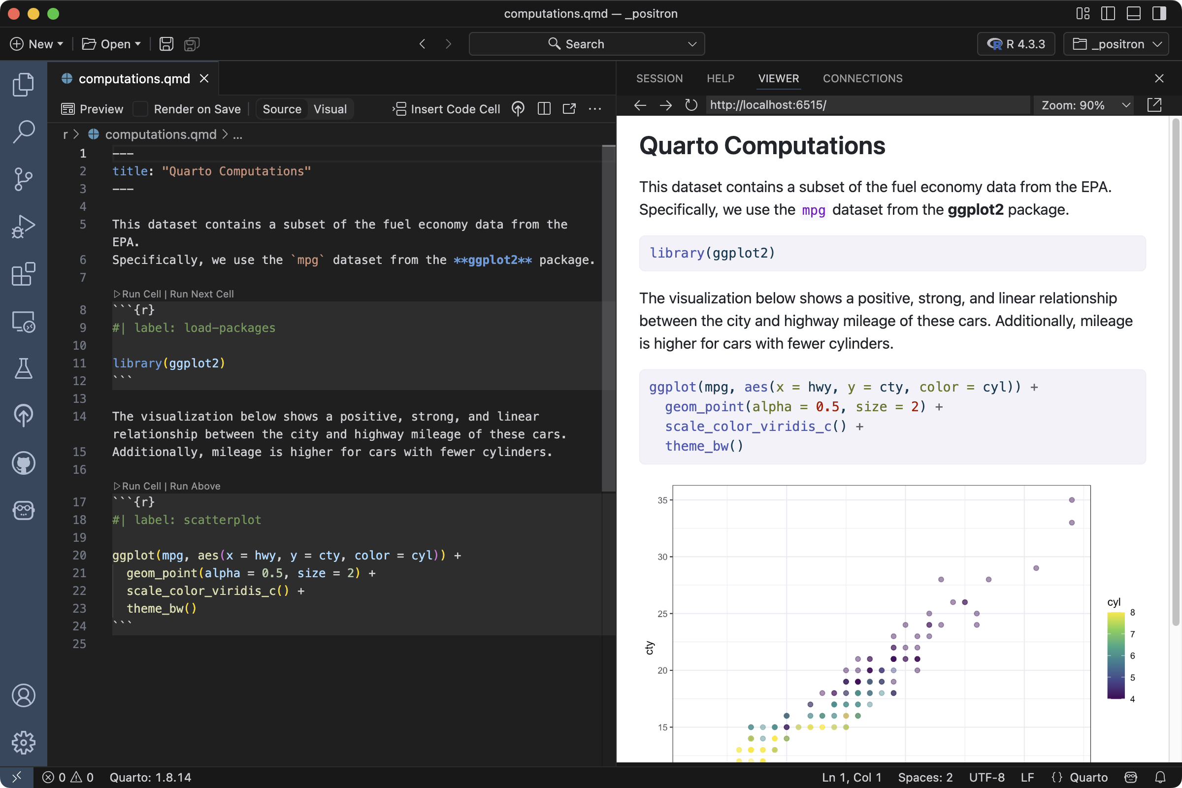
Install the
jupyterandplotninepackages using your preferred method. For example, withpip:pip install jupyter plotnineDownload
computations.qmdbelow and open it in Positron.Run the Quarto: Preview command, use the keyboard shortcut , or use the Preview button (
) in the editor toolbar, to render and preview the document.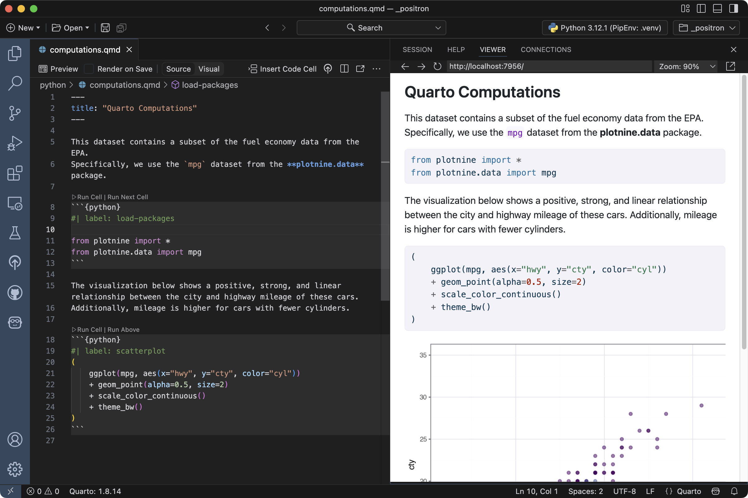
Cell Execution
As you author a document you may want to execute one or more code cells without re-rendering the entire document. You can do this using the Run Cell button above the code cell. Click that button to execute the cell in the Console:
There are a variety of commands and keyboard shortcuts available for executing cells:
| Quarto Command | Keyboard Shortcut |
|---|---|
| Run Current Cell | |
| Run Current Code | |
| Run Next Cell | |
| Run Previous Cell | |
| Run Cells Above | |
| Run Cells Below | |
| Run All Cells |
Cell Output
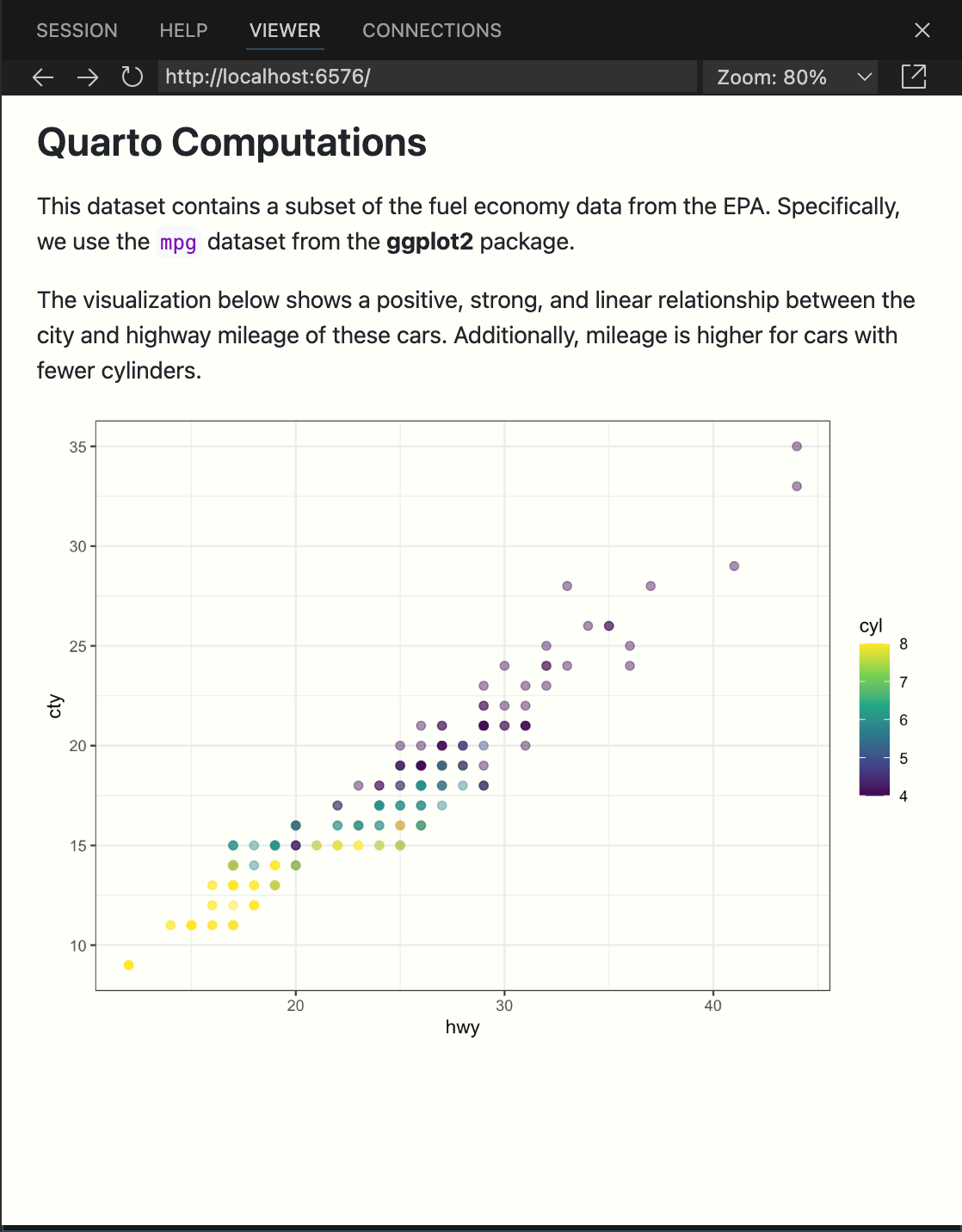
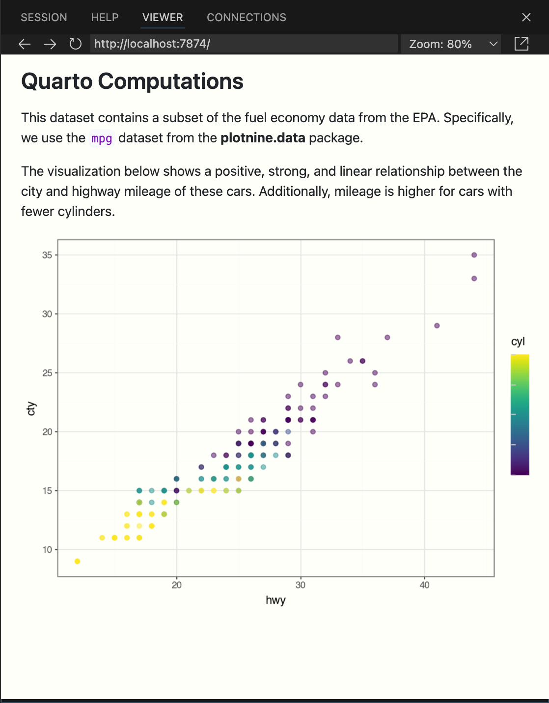
By default, the code and its output are displayed within the rendered document.
However, for some documents, you may want to hide all of the code and just show the output. To do so, specify echo: false in document header.
---
title: "Quarto Computations"
echo: false
---
If you checked Render on Save earlier, just save the document after making this change for a live preview. Otherwise run Quarto: Preview again to see your updates reflected. The result will look like the following.
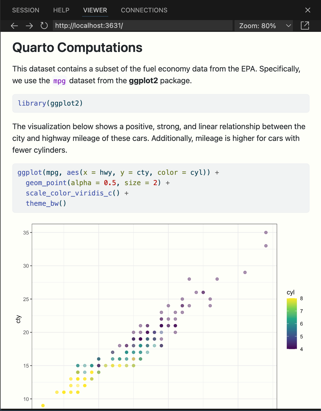
You might want to selectively enable code echo for some cells. To do this add the echo: true option to a code cell. Try this with the chunk labelled scatterplot.
#| label: scatterplot
#| echo: true
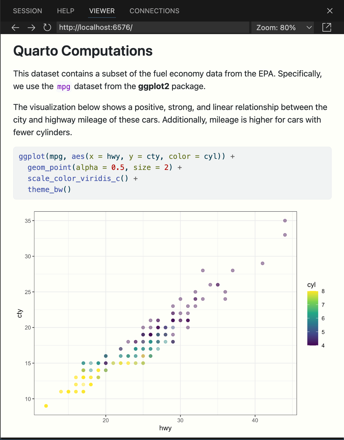
ggplot(mpg, aes(x = hwy, y = cty, color = cyl)) +
geom_point(alpha = 0.5, size = 2) +
scale_color_viridis_c() +
theme_bw()#| label: scatterplot
#| echo: true
(
ggplot(mpg, aes(x="hwy", y="cty", color="cyl"))
+ geom_point(alpha=0.5, size=2)
+ scale_color_continuous()
+ theme_bw()
)Save the document again and note that the code is now included for the scatterplot chunk.
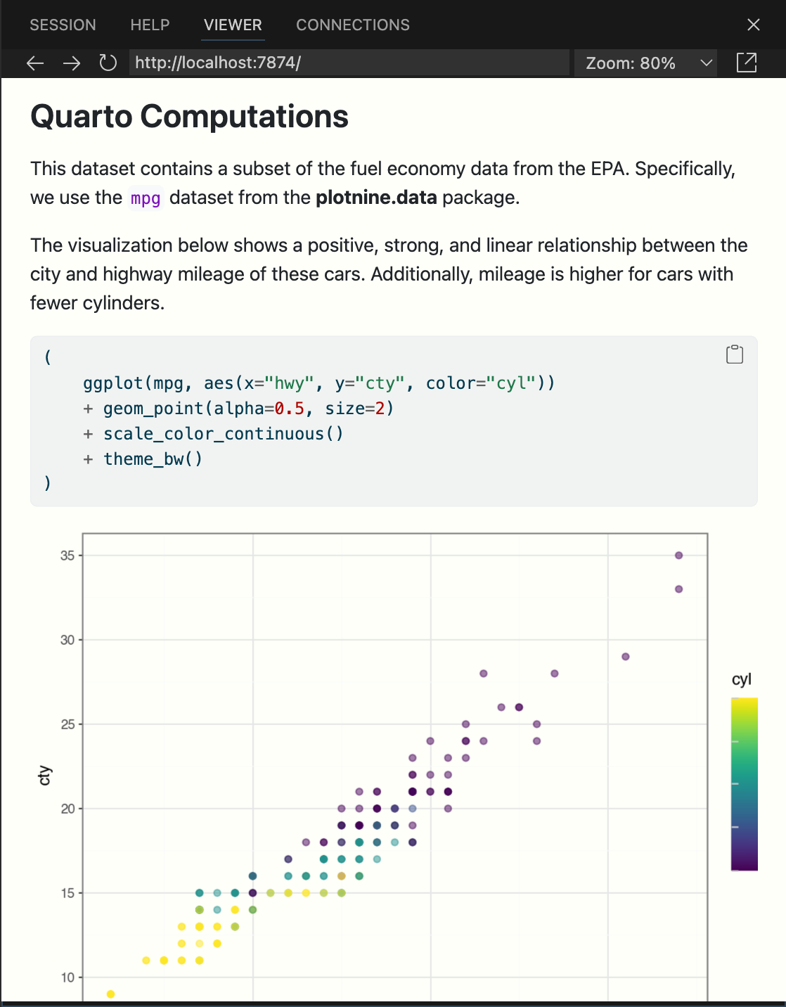
There are a large number of other options available for cell output, for example warning for showing/hiding warnings (which can be especially helpful for package loading messages), include as a catch all for preventing any output (code or results) from being included in output, and error to prevent errors in code execution from halting the rendering of the document (and print the error in the rendered document).
See the Knitr Cell Options documentation for additional details.
See the Jupyter Cell Options documentation for additional details.
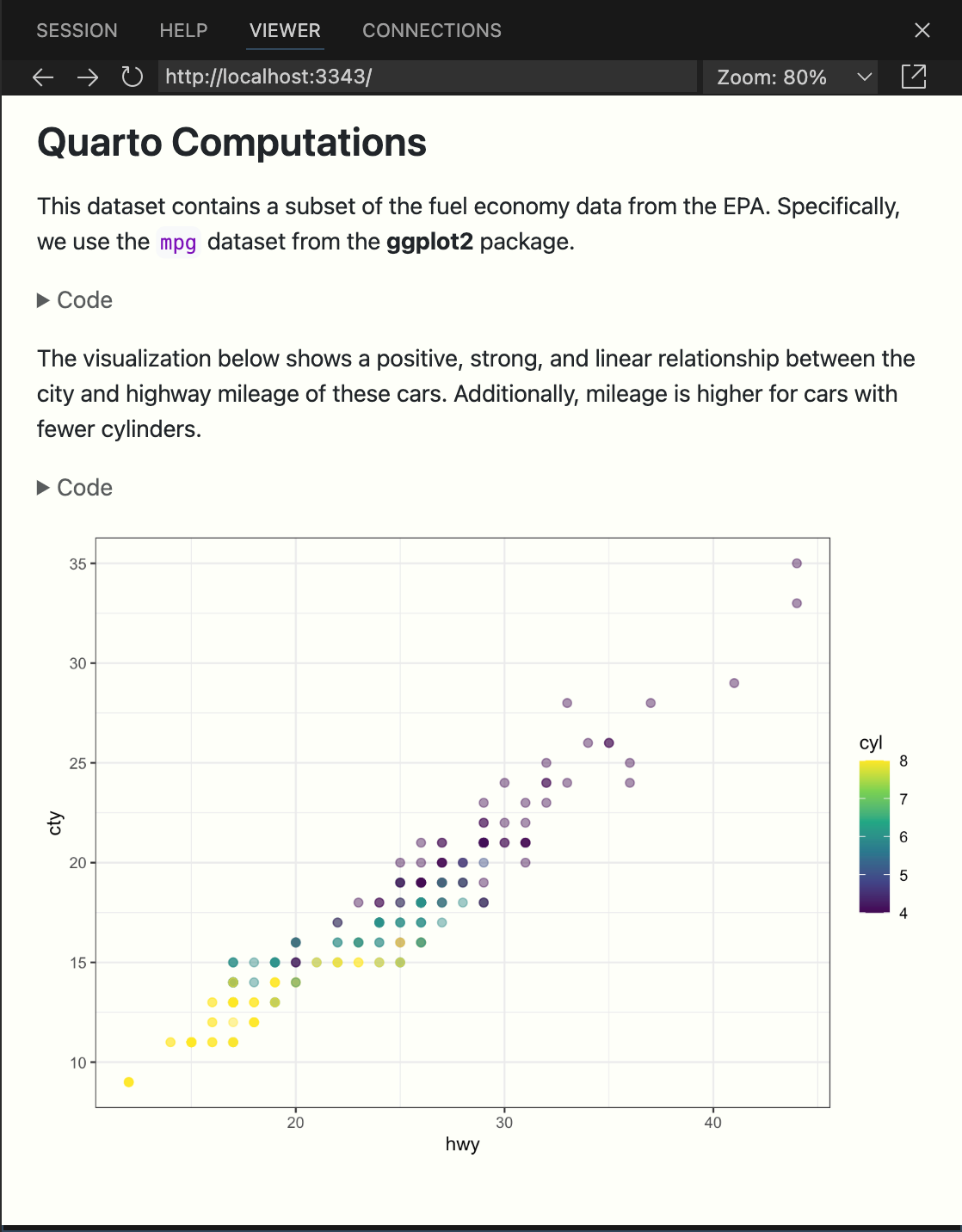
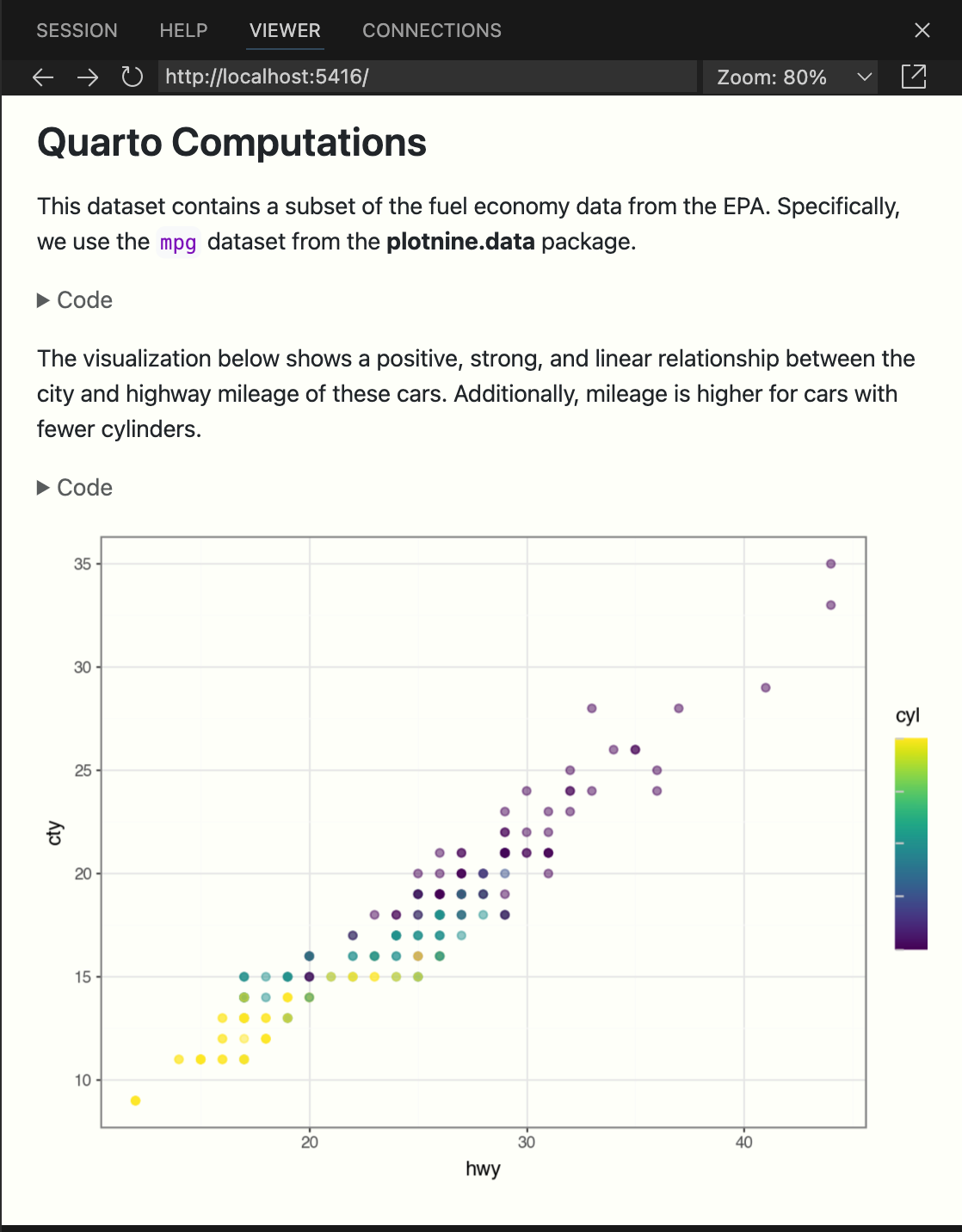
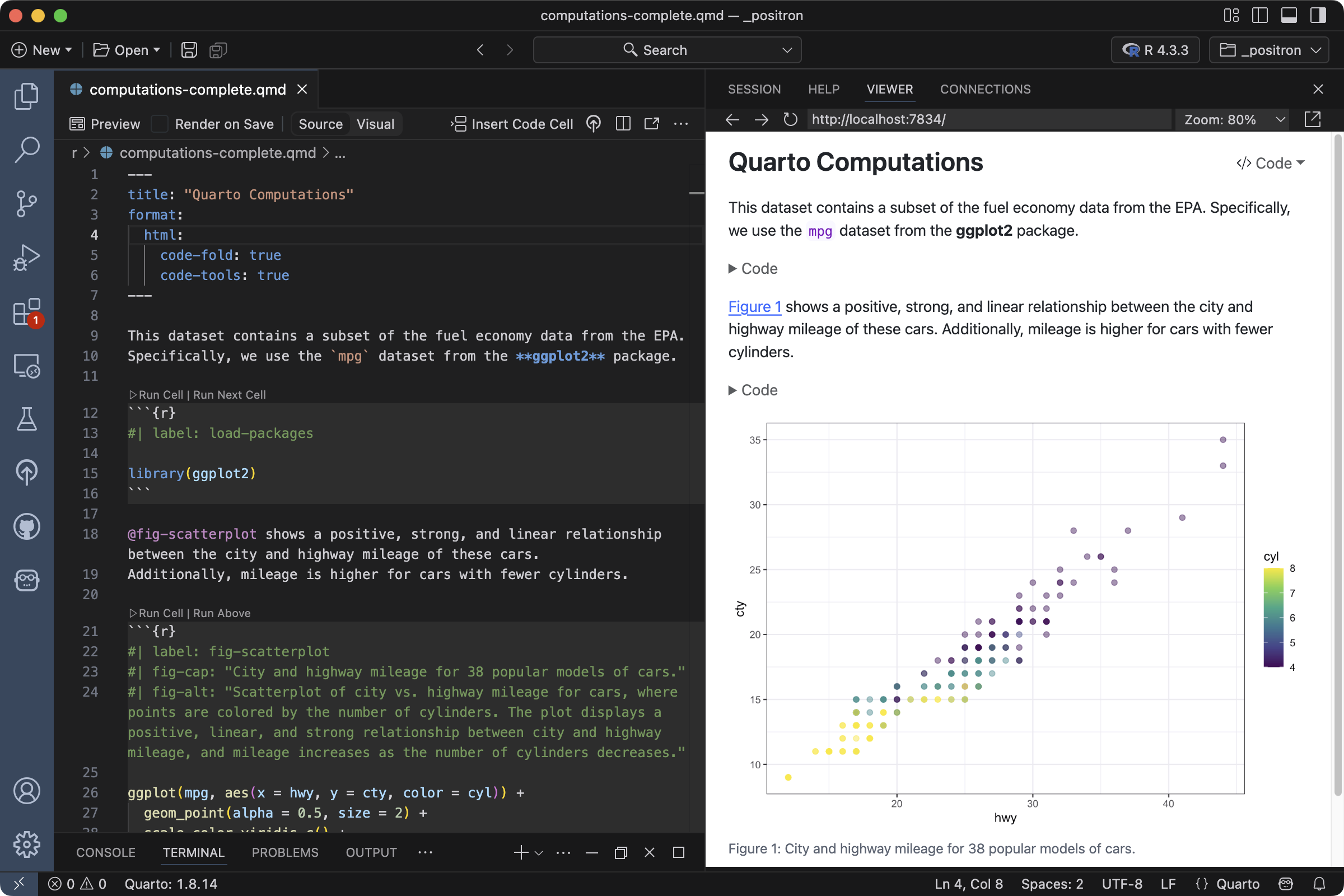
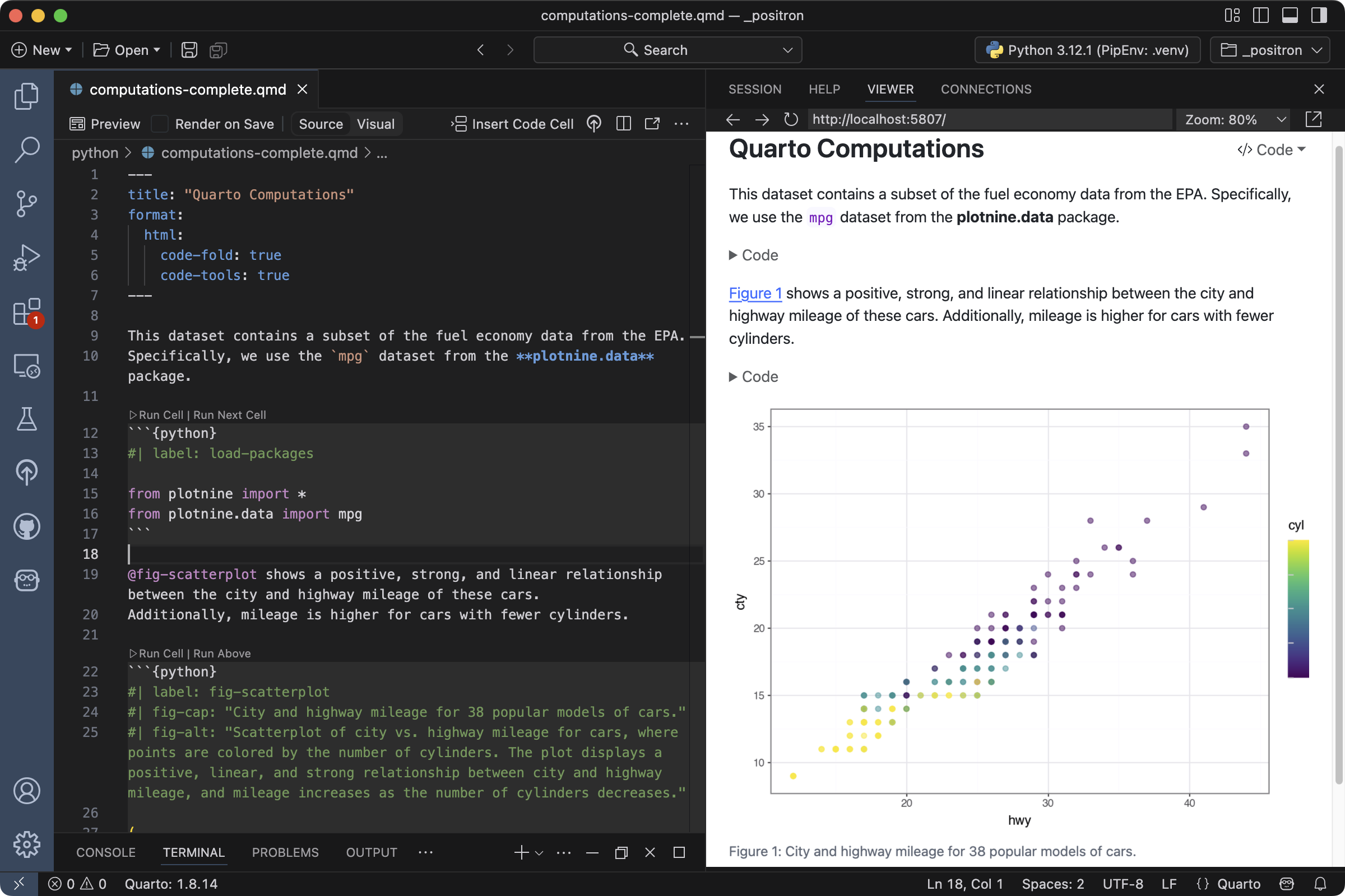
Code Folding
Rather than hiding code entirely, you might want to fold it and allow readers to view it at their discretion. You can do this via the code-fold option. Remove the echo option we previously added and add the code-fold HTML format option.
---
title: "Quarto Computations"
format:
  html:
    code-fold: true
---
Save the document again and note that new Code widgets are now included for each code chunk.
You can also provide global control over code folding. Try adding code-tools: true to the HTML format options.
---
title: "Quarto Computations"
format:
  html:
    code-fold: true
    code-tools: true
---
Save the document and you’ll see that a code menu appears at the top right of the rendered document that provides global control over showing and hiding all code.
Figures
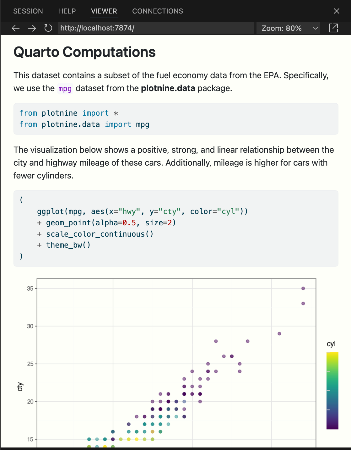
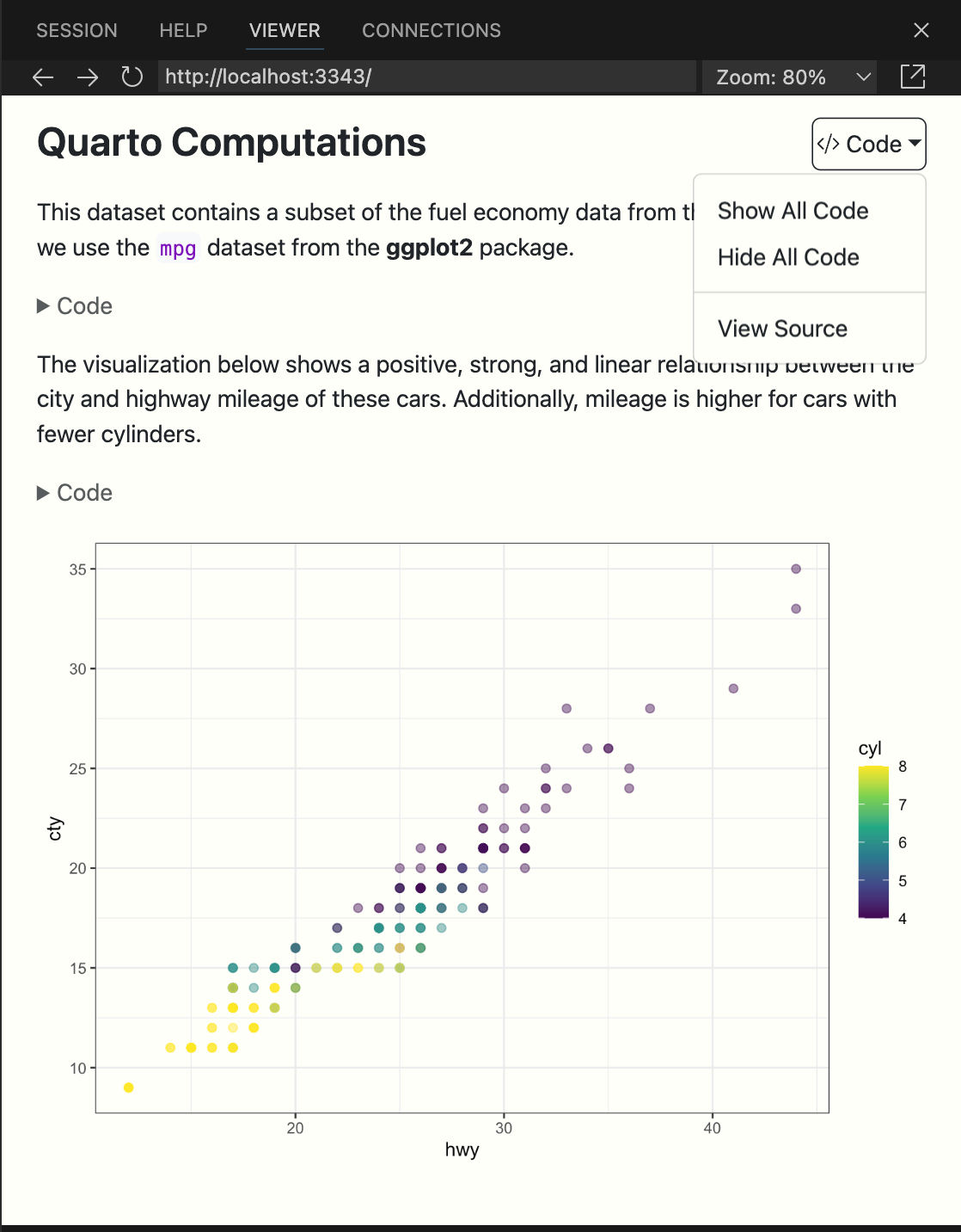
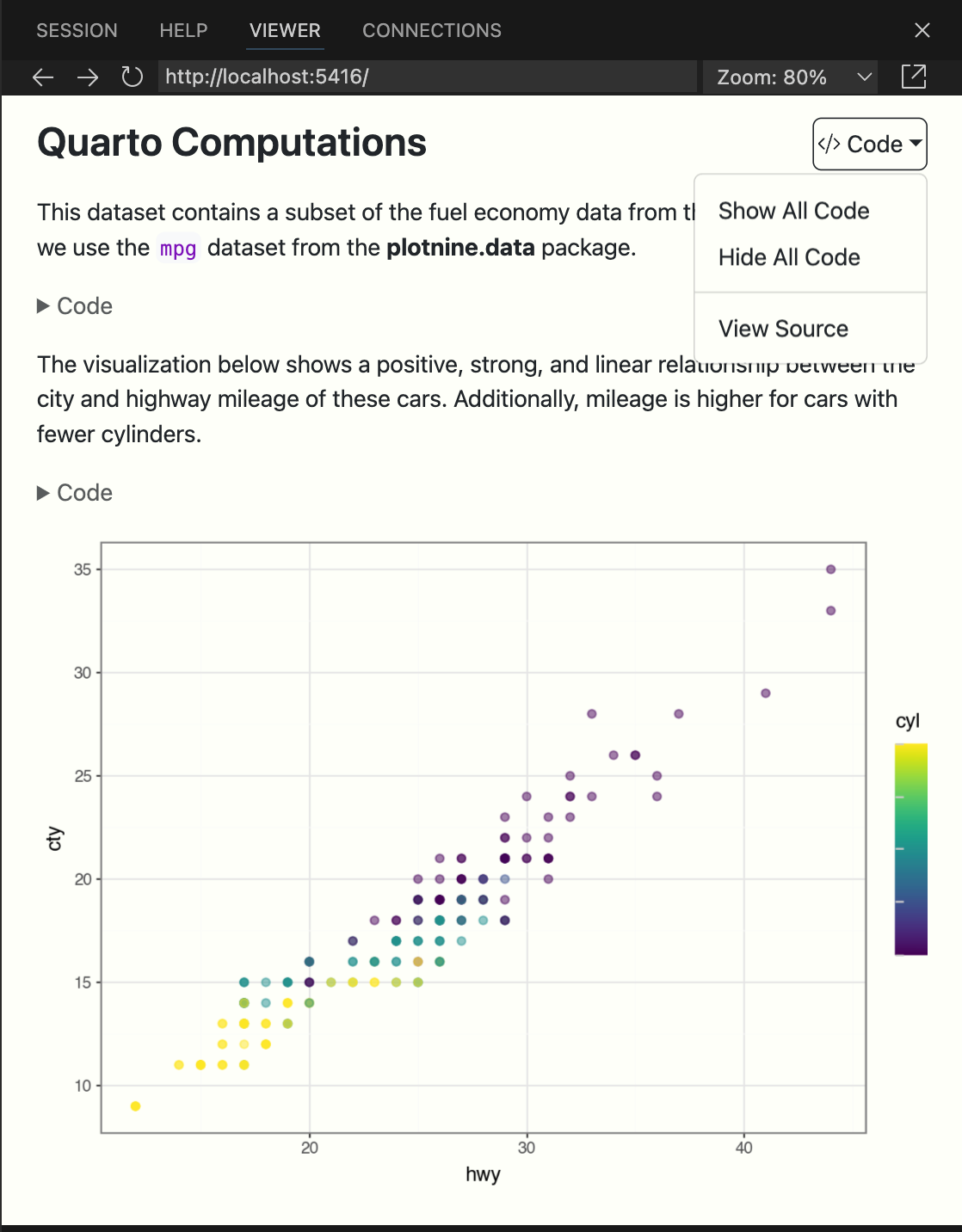
Figures produced by code cells are automatically included in the rendered output. Code cell options provide additional control over how figures are displayed. For example, we can add a caption with fig-cap, and improve accessability by adding alternative text with fig-alt to the scatterplot code cell:
#| fig-cap: "City and highway mileage for 38 popular models of cars."
#| fig-alt: "Scatterplot of city vs. highway mileage for cars, where points are colored by the number of cylinders. The plot displays a positive, linear, and strong relationship between city and highway mileage, and mileage increases as the number of cylinders decreases."
To cross-reference a figure use a label that starts with fig-:
#| label: fig-scatterplotThen you can update the narrative to refer to the figure using its label:
@fig-scatterplot shows a positive, strong, and linear relationship between the city and highway mileage of these cars.Preview the document to see the updated plot.
You can also control the size of all the figures in the document by setting fig-width and fig-height, in inches, in the document header:
---
title: "Quarto Computations"
fig-height: 3.5
fig-width: 6
---To set individual figure sizes, use the fig-width and fig-height options as code cell options:
#| label: fig-scatterplot
#| fig-width: 6
#| fig-height: 3.5
ggplot(mpg, aes(x = hwy, y = cty, color = cyl)) +
  geom_point(alpha = 0.5, size = 2) +
  scale_color_viridis_c() +
  theme_bw()
To set individual figure sizes, specify the plot size in your code. For example, in plotnine you can use figure_size argument to theme():
(
    ggplot(mpg, aes(x="hwy", y="cty", color="cyl"))
    + geom_point(alpha=0.5, size=2)
    + scale_color_continuous()
    + theme_bw()
    + theme(figure_size=(6, 3.5))
)
Multiple Figures
Let’s add another plot to our chunk—a scatterplot where the points are colored by engine displacement, using a different color scale. Our goal is to display these plots side-by-side (i.e., in two columns), with a descriptive subcaption for each plot. Since this will produce a wider visualization we’ll also use the column option to lay it out across the entire page rather than being constrained to the body text column.
There are quite a few changes to this chunk. To follow along, copy and paste the options outlined below into your Quarto document.
#| label: fig-scatterplot
#| fig-cap: "City and highway mileage for 38 popular models of cars."
#| fig-subcap:
#|   - "Color by number of cylinders"
#|   - "Color by engine displacement, in liters"
#| layout-ncol: 2
#| column: page

ggplot(mpg, aes(x = hwy, y = cty, color = cyl)) +
  geom_point(alpha = 0.5, size = 2) +
  scale_color_viridis_c() +
  theme_minimal()

ggplot(mpg, aes(x = hwy, y = cty, color = displ)) +
  geom_point(alpha = 0.5, size = 2) +
  scale_color_viridis_c(option = "E") +
  theme_minimal()
#| label: fig-scatterplot
#| fig-cap: "City and highway mileage for 38 popular models of cars."
#| fig-subcap:
#| - "Color by number of cylinders"
#| - "Color by engine displacement, in liters"
#| layout-ncol: 2
#| column: page
cyl_plot = (
ggplot(mpg, aes(x="hwy", y="cty", color="cyl"))
+ geom_point(alpha=0.5, size=2)
+ scale_color_continuous()
+ theme_bw()
)
cty_plot = (
ggplot(mpg, aes(x="hwy", y="cty", color="displ"))
+ geom_point(alpha=0.5, size=2)
+ scale_color_continuous(cmap_name="cividis")
+ theme_bw()
)
cyl_plot.show()
cty_plot.show() Additionally, replace the existing text that describes the visualization with the following.
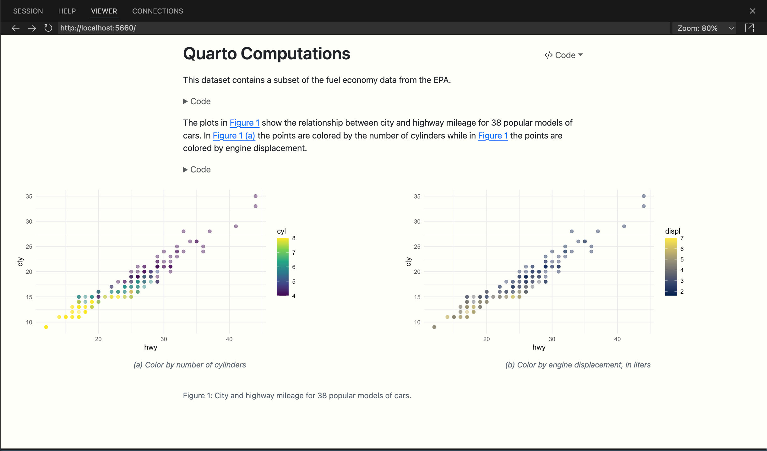
The plots in @fig-scatterplot show the relationship between city and highway mileage for 38 popular models of cars.
In @fig-scatterplot-1 the points are colored by the number of cylinders while in @fig-scatterplot the points are colored by engine displacement.
Then, save the document and preview the output, which should look like the following.
The layout in Quarto HTML documents is responsive. If you are viewing the document on a narrow screen, the figures will stack vertically rather than being displayed side-by-side.
Let’s discuss some of the new options used here. You’ve seen fig-cap before but we’ve now added a fig-subcap option.
#| fig-cap: "City and highway mileage for 38 popular models of cars."
#| fig-subcap:
#|   - "Color by number of cylinders"
#|   - "Color by engine displacement, in liters"
For code cells with multiple outputs adding the fig-subcap option enables us to treat them as subfigures.
We also added an option to control how multiple figures are laid out—in this case we specified side-by-side in two columns.
#| layout-ncol: 2If you have 3, 4, or more figures in a panel there are many options available for customizing their layout. See the article Figure Layout for details.
Finally, we added an option to control the span of the page that our figures occupy.
#| column: pageThis allows our figure display to span out beyond the normal body text column. See the documentation on Article Layout to learn about all of the available layout options.
Using Code in Markdown Text
To include executable expressions within markdown, enclose the expression in `{r} `1.
To include executable expressions within markdown, enclose the expression in `{python} `.
For example, we can use inline code to state the number of observations in our data. Try adding the following markdown text to your Quarto document.
There are `{r} nrow(mpg)` observations in our data.There are `{python} len(mpg)` observations in our data.Save your document and preview the rendered output. The expression inside the backticks has been executed and the sentence includes the actual number of observations.
There are 234 observations in our data.
If the expression you want to inline is more complex, involving many functions or a pipeline, we recommend including it in a code chunk (with echo: false) and assigning the result to an object. Then, you can call that object in your inline code.
For example, say you want to state the average city and highway mileage in your data. First, compute these values in a code chunk.
```{r}
#| echo: false

mean_cty <- round(mean(mpg$cty), 2)
mean_hwy <- round(mean(mpg$hwy), 2)
```
```{python}
#| echo: false
mean_cty = round(mpg['cty'].mean(), 2)
mean_hwy = round(mpg['hwy'].mean(), 2)
```Then, add the following markdown text to your Quarto document.
The average city mileage of the cars in our data is `{r} mean_cty` and the average highway mileage is `{r} mean_hwy`. The average city mileage of the cars in our data is `{python} f"{mean_cty:.2f}"` and the average highway mileage is `{python} f"{mean_hwy:.2f}"`. Save your document and preview output. You should see the average city and highway mileage included in the text.
The average city mileage of the cars in our data is 16.86 and the average highway mileage is 23.44.
For additional details on inline code expressions, please visit the Inline Code documentation.
Wrapping Up
If you followed along step-by-step with this tutorial, you should now have a Quarto document that implements everything we covered. Otherwise, you can download a completed version of computations.qmd below.
Next Up
You’ve now covered the basics of customizing the behavior and output of executable code in Quarto documents.
Next, check out the Authoring Tutorial to learn more about output formats and technical writing features like citations, crossrefs, and advanced layout.
Footnotes
Quarto also supports the Knitr syntax
`r `, read more in Inline Code↩︎